Welcome to Shiny basics, in which we make our first app!
- Code our first shiny app
- Learn about the parts of a shiny app (ui and server)
- Build a basic understanding of shiny reactivity.
You can follow this tutorial however suits your needs best. It goes with this video of me coding the app “live” from scratch. You can also follow along using the app.R file located in this folder if you’d rather look at the finished product as we describe its components.
Before we begin
Before we get going on our app, we need to pause and make sure we all have the right software installed. We’ll need the latest versions of R and RStudio installed on our computers. The only R package we need for this tutorial is shiny itself. If you don’t have shiny installed yet, open an RStudio window. In the console type:
install.packages("shiny")
Shiny is a big package, so don’t worry if it takes a moment to install. If shiny installs properly for you and you can load it properly by running library(shiny) in a script or in the console, continue to the next step. If you have difficulties installing or loading shiny, let one of us know ASAP and we’ll help you get it figured out. Ready to dive in? Great! Let’s make a plot!
Let’s make a plot
Our example shiny app will use one of R’s built-in datasets, Loblolly. Loblolly records height at age of Loblolly pine trees over the course of their lives. Let’s take a quick peak at the data:
head(Loblolly)
   height age Seed
1    4.51   3  301
15  10.89   5  301
29  28.72  10  301
43  41.74  15  301
57  52.70  20  301
71  60.92  25  301
Right away, we see some information about tree age, in the “age” variable and tree height in the “height” variable. I’m going to assume age is in units of years and height is in units of feet (sorry) since Loblolly pines are native to the Southeastern United States. A scattern plot displaying height as a function of age seems like a natural way to visualize this data, so that’s what we’ll do!
   plot(Loblolly$age,  # age on the x axis
        Loblolly$height, # and height on the y
   xlab = "Age (Years)", # Let's add some axis labels
   ylab = "Height (Feet)")
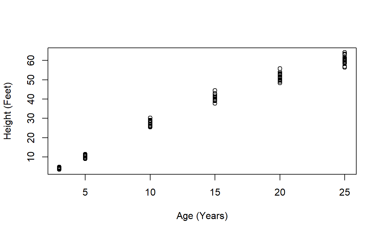
Our plot shows that trees get taller over time (yay!). What if we’re working with a decision-maker who wants to visualize growth of trees in ages 10 and younger? We could subset our data to include only trees under the age of 10 and then remake the plot:
 # We subset our data to trees 10 or younger

   LoblollySmall <- Loblolly[Loblolly$age <= 10,]

   # Then make our plot as before!

   plot(LoblollySmall$age, LoblollySmall$height,
   xlab = "Age (Years)",
   ylab = "Height (Feet)")
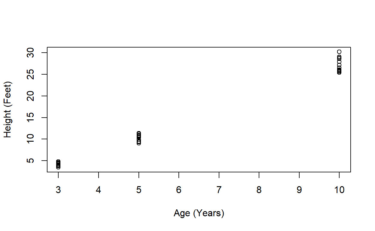
This works just fine, but if our decision-maker isn’t an R expert, they have to ask us for a different plot each time they want to look at a new age range. This is not a good use of anyone’s time. So:
Let’s make an app!
This is the point where watching me do this in the recorded video lesson will be quite helpful if you’re totally new to shiny apps. Not only will you get my verbal explanations of what’s happening, but you also get to watch me make (hopefully informative) mistakes, which gives you a better idea of how the app development process goes.
Before we start coding our app, we need a safe place for it to live. Open RStudio and make yourself a new folder on your computer somewhere that will be easy to find and remember using the dir.create() function typing directly in the console. My new directory is located in the directory where I’m building this workshop website (using the distill package, btw). It doesn’t matter where yours is located, as long as we can find it again in a minute.
dir.create("C:/Users/Lyndsie/Documents/GitHub/shiny_workshop/exampleApps")
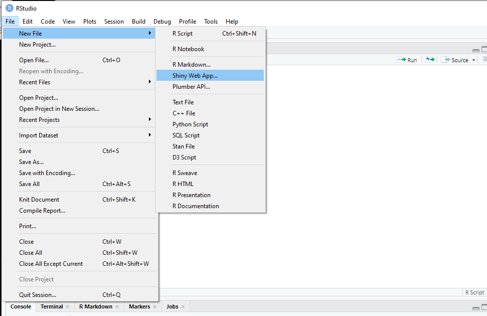
To start a new shiny app, we’ll open RStudio and click File>New File>Shiny Web App.
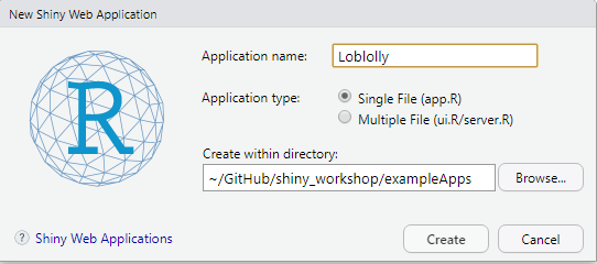
In the new shiny web application dialog box, we’re prompted to choose a name for our app. We’ll call it “Loblolly” and ititate it as a single file app using the radio selector buttons. We’re also given the option to place our new app in an existing directory. Click “browse” and navigate to the directory we created using dir.create() and initiate our app by clicking “Create.”
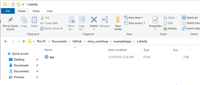
If we look in ~/exampleApps the directory that we created earlier, we now see a folder called “Loblolly/” containing one file, “app.R”
New shiny apps initiate with a great example app provided by the folks at RStudio using the “Old Faithful” sample dataset. The app consists of a slider that lets us selecthte number of bins in a histogram. Let’s pause briefly to play with the example app a bit. Click the “Run App” button and experiment with the slider.
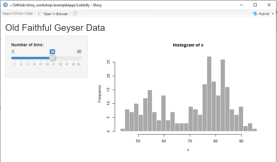
Once you’ve satisfied your curiosity a little, close the browser window and delete all the code in app.R so we have a blank script. Don’t worry. We won’t break anything and it will work better for us to learn by building our app up from scratch.
![]()
Getting started
We’ll start setting up our app by loading the shiny library outside the app code itself. We put these lines outside the main app code so they’re run just once, which reduces memory needs and run time.
Basic app structure
Shiny apps are built in two pieces: the user interface and server. The user interface (ui), as the name suggests, creates all the elements that the user engages with. It contains all the static text and defines the appearence of interactive widgets like dropdowns and sliders, as well as page layouts:
The second fundamental element, the server, does all the background work to run the app. The “magic” of a Shiny app is reactivity, the feedback between server and ui: the user manipulates the interactive elements in the ui, then the server process user input and returns dynamic data and graphics elements. We define the server using the function(input, output), telling our app to look for inputs from objects labeled “input” and pass outputs labeled “output.”
# Load libraries and do other one-time tasks outside main app code.

library(shiny)
# user interface
# ui defines everything the user sees and interacts with
# Fluid page organizes shiny app into rows and columns.
ui <- fluidPage(
)
# server is where the magic happens
# all the back-end stuff
# manipulating data
# building reactive visuals
server <- function(input, output) {
}
Shiny assembles the server and ui into a cohesive unit using the shinyApp() function:
# Load libraries and do other one-time tasks outside main app code.

library(shiny)

# user interface
# ui defines everything the user sees and interacts with
# Fluid page organizes shiny app into rows and columns.

ui <- shinyUI(fluidPage(

      )
    )

# server is where the magic happens
# all the back-end stuff
# manipulating data
# building reactive visuals

server <- function(input, output) {

}

# Runs the app

shinyApp(ui = ui, server = server)
Now that we have a handle on the basic structure of the app, let’s dive into our pine growth visualization! In each step, we will build on the previous step, until we build all the code we need to run the app.
UI
The first thing we need to decide for our new app’s ui is how we want the text and visualization to be organized on the pages. Remember that Shiny apps make websites, so we have to plan out both the overall structure of the app’s pages and how they relate, as well as the layout and organization of each page. The organization of the user interface code is consequently hierarchical, with each page’s elements nested in a page layout, which is in turn nested in the whole app’s layout.
We’ll start out with a very simple layout, called a “fluidPage.” fluidPage organizes the content of our shiny app by dividing space into rows and columns that we fill with text and visualizations. There are lots of other layout options for when you’re ready to make your own apps.. We define this structure using the function fluidPage(). We’ll define the title of our page, which will show up in the top left, by typing it in quotes: "Loblolly app" So we’ve updated our empty shinyUI function from above to read:
Notice that we’re indenting the parentheses on seperate lines. Even though R doesn’t have semantic indenting like some other languages (i.e., R doesn’t read this any different than parentheses nested on the same line), visually breaking up our code like this can make it easier for us to read and debug later. At this point, we have a totally functional, if not very interesting, shiny app. If we click “Run App” RStudio will launch a browser window that just says “Loblolly app” in the upper left hand corner.
![]()
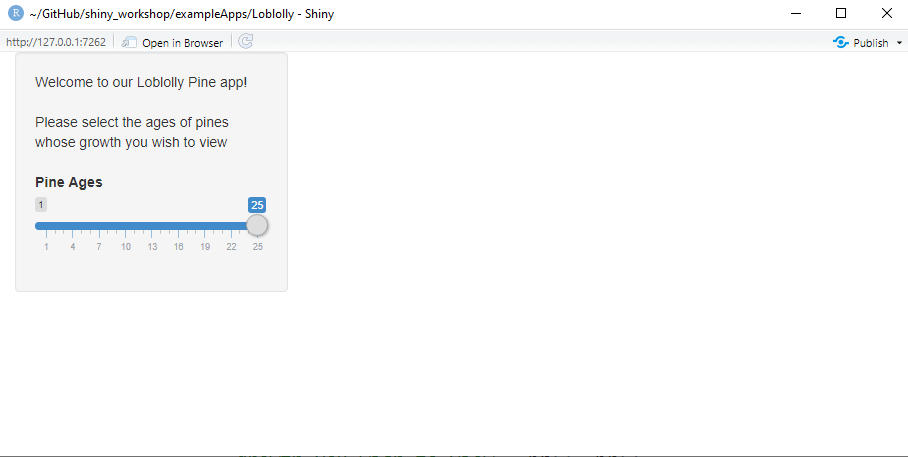
Now let’s get rid of our “Loblolly app” sample text and add some content to our app! We’re going to use a sidebarLayout, which creates a shaded a side panel and a main panel. The side panel and main panel can both hold text, plots, maps, user input widgets, videos, and whatever else we need them to hold. The advantage of using a sidebarPanel() is that it draws the user’s eye, so it’s a great structure for communicating instructions and introductory material. Our sidepanel will hold a brief welcome for the user and a user input widget that prompts users select the age range over which they wish to visualize pine growth. We’ll also add some comments so we can remember what we were doing later. Just in case we need to say… write a tutorial explaining how to build a shiny app. One of the cool things about shiny is that you can create html outputs using a range of coding languages. We’ll use just a little bit of html here by typing br() a few times strategically to create some nice visual breaks on the page.
We’ll also add a main panel to go next to our side panel, defined using the mainPanel() function. It doesn’t have anything in it yet, which is ok. It just needs to be there so sidebarLayout() is satisfied that all its components have been accounted for. If we launch our app at this point, we should have a sidebar with a functional but so far useless slider bar.
ui <- fluidPage(

        # SidebarLayout creates a page with 2 panels: side and main.

        sidebarLayout(

            # sidebarPanel makes the container that holds the sidebar content
            # We'll start by displaying a welcome message

            sidebarPanel(
                       "Welcome to our Loblolly Pine app!", br(), br(),
                        "Please select the ages of pines whose
                        growth you wish to view", br(), br(),

            # And then add our reactive element: a slider input.
            # The slider controls the ages of the pines that will show up in our growth plot
            # We give it a name, "ages" for us to pass to server
            # and a name to display to the user, "Pine Ages"

                            sliderInput("ages",
                                        "Pine Ages",
                                        min = 1, # We give the slider a minimum value
                                        max = 25, # And a maximum value
                                        value = 25)  # And set the default value for the slider to start at
                      ),

            mainPanel(

            )
        )
    )
Server
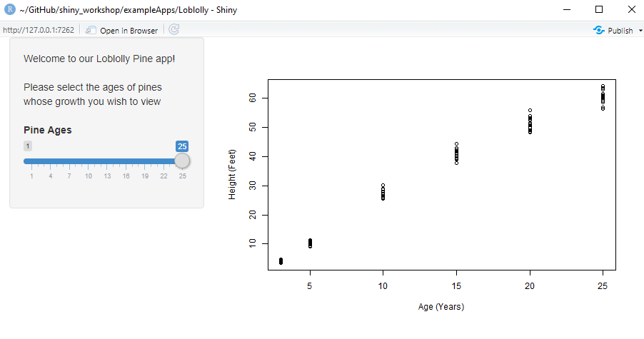
Now that we have our user interface set up, we need some cool data products for it to display! Let’s bring back our Loblolly pine plot from earlier, but link it to the slider we built in UI so our hypothetical decision-maker can manipulate the displayed age visualization for themselves. We’ll set up our reactively updating plot using the renderPlot({}) function. Notice that renderPlot({}) uses a curly bracket nested inside the parentheses. That’s because renderPlot({}) is reactive, meaning it needs user input to function.
Reactivity is the ability of Shiny apps to receive user inputs and perform operations that are then returned to the user as updating visuals and values. This helps our Shiny app update only what’s needed at each step and keep its processing time reasonable. Even though we only receive the user’s input once, each time we use the information we receive from the user, it will need to be a reactive({}) value because all the values “downstream” of the user’s input depend on the value of that input. It’s generally good practice to keep our reactive values simple, so that when (not if) our code breaks, we will have an easier time identifying the problem.
We’ll use renderPlot({}) to create a plot object called pinePlot inside our output object. This will be the key we use in a moment to link server and ui together. We’re going to use renderPlot({}) to do two things: subset the data to the user’s specified date range, like we did when we first built the plot, and build the plot so we can look at it over in ui. Just like when we manually subsetted the Loblolly data into Loblolly small, we’ll keep only rows where age is less than or equal to a maximum age. We specified in ui that the user-specified maximum age is saved to an object called input$ages using the slider, so we simply swap out our static maximum age for the reactively updating value from the input$ages slider.
server <- function(input, output) {

   # Our server has one element in the output object: a plot called pinePlot
   # We create pinePlot using the renderPlot() function
   # renderPlot() takes input from ui, uses it to refine the data, and
   # creates the Loblolly growth plot, then passes it back to ui.

   output$pinePlot <-  renderPlot({

   # We subset our data using the input from the slider in the side panel.

   LoblollySmall <- Loblolly[Loblolly$age <= input$ages,]

   # Then make our plot as before!

   plot(LoblollySmall$age, LoblollySmall$height,
   xlab = "Age (Years)",
   ylab = "Height (Feet)")
   })
}
Pulling it all together
The last step is to display output$pinePlot in ui. We simply use the plotOutput function to add pinePlot from the output defined by server, and there we have it, a fully functional shiny app!
# Load libraries and do other one-time tasks outside main app code.

library(shiny)

# user interface
# ui defines everything the user sees and interacts with
# Fluid page organizes shiny app into rows and columns.


ui <- fluidPage(
          # SidebarLayout creates a page with 2 panels: side and main.

                 sidebarLayout(

                   # sidebarPanel makes the container that holds the sidebar content
                   # We'll start by displaying a welcome message

                   sidebarPanel(
                     "Welcome to our Loblolly Pine app!", br(), br(),
                     "Please select the ages of pines whose
                        growth you wish to view", br(), br(),

                     # And then add our reactive element: a slider input.
                     # The slider controls the ages of the pines that will show up in our growth plot
                     # We give it a name, "ages" for us to pass to server
                     # and a name to display to the user, "Pine Ages"

                     sliderInput("ages",
                                 "Pine Ages",
                                 min = 1, # We give the slider a minimum value
                                 max = 25, # And a maximum value
                                 value = 25)  # And set the default value for the slider to start at
                   ),

                   mainPanel(

                     # Display pine plot

                     plotOutput("pinePlot")

                   )
               )
            )


# server is where the magic happens
# all the back-end stuff
# manipulating data
# building reactive visuals

server <- function(input, output) {

  # Our server has one element in the output object: a plot called pinePlot
  # We create pinePlot using the renderPlot() function
  # renderPlot() takes input from ui, uses it to refine the data, and
  # creates the Loblolly growth plot, then passes it back to ui.

  output$pinePlot <-  renderPlot({

    # We subset our data using the input from the slider in the side panel.

    LoblollySmall <- Loblolly[Loblolly$age <= input$ages,]

    # Then make our plot as before!

    plot(LoblollySmall$age, LoblollySmall$height,
         xlab = "Age (Years)",
         ylab = "Height (Feet)")
  })
}

# Runs the app

shinyApp(ui = ui, server = server)
Article by Lyndsie Wszola